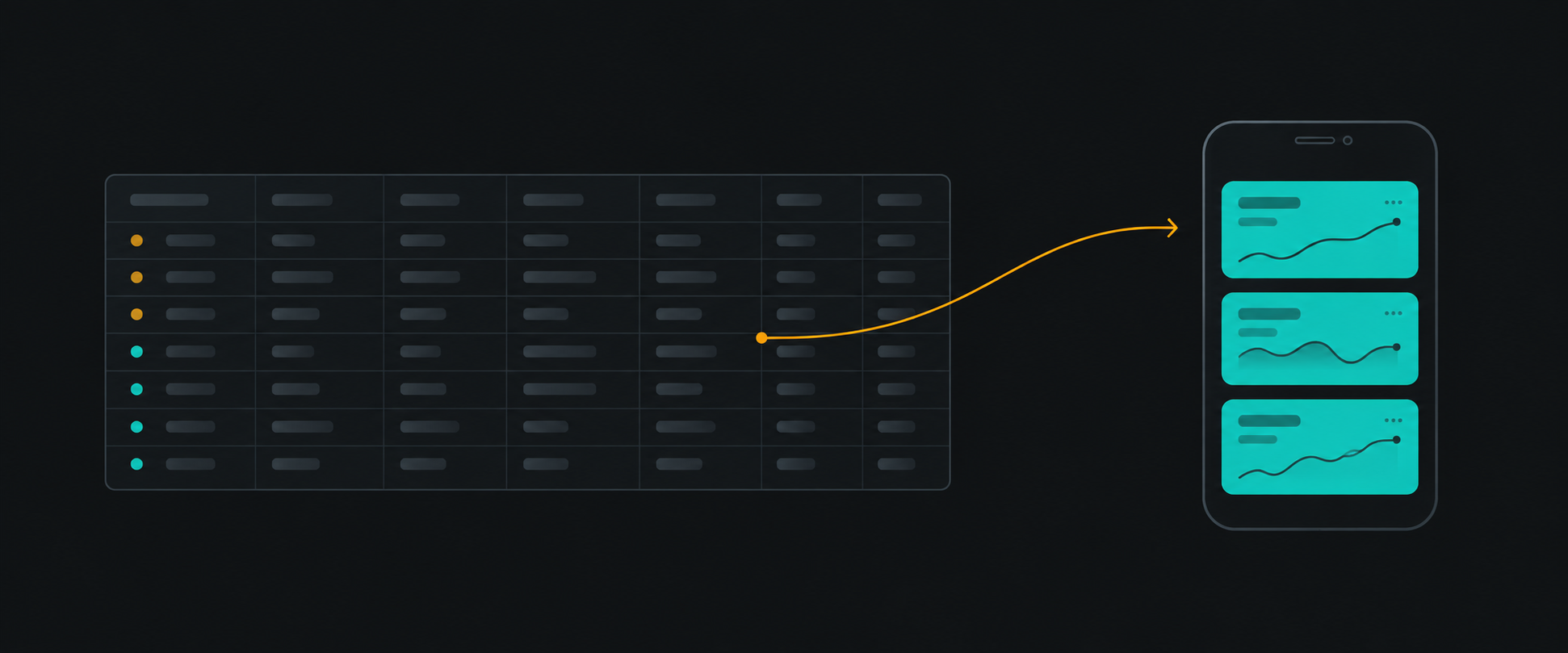
The worst mobile dashboards aren't badly coded — they're desktop tables mechanically compressed until nothing fits. Columns get hidden, fonts shrink, and the user pinch-zooms their way to an answer the desktop gets in one glance.
Real responsive design for data-heavy software starts with a different question.
Start with the mobile user's core decision
Ask: what decision does someone make on their phone? On a fleet dashboard, it's rarely "scan 30 columns." It's "is anything broken, and what needs me first?"
That reframes the whole layout. The phone doesn't need the table — it needs the answer.
Summary cards, not compressed tables
The pattern that works:
Progressive disclosure replaces density. The table still exists — behind a tap, with its own mobile layout — but it's no longer the landing surface.
Mobile filtering and sorting
Desktop filter rows (dropdown, dropdown, datepicker, apply) don't survive 375px. What survives:
- Bottom-sheet filters with a visible active-count badge
- Sort as a single control on the primary metric, not a column-header menu with 8 targets
- Persistent filter chips so users can see and remove active constraints
The details that separate good from broken
| Concern | What works |
|---|---|
| Trends | Sparklines inside cards; full charts on detail views |
| Touch targets | 44px minimum — data rows are links, not hover-tooltips |
| Loading | Skeletons shaped like the cards, not a global spinner |
| Live data | Batched updates (see Real-Time Frontends Don't Need to Re-render in Real Time) — a phone ticking every second drains battery and attention |
| Overflow | Know when horizontal scroll is acceptable (see below) |
The reusable rule
For every desktop surface, write down:
- The one decision a mobile user needs to make
- The minimum data that decision requires
- What gets demoted to progressive disclosure
If you can't fill in line 1, the mobile experience will be a compressed desktop table no matter how good the CSS is.