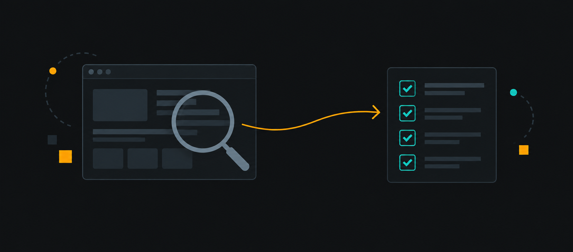
A site review gets useful when it stops being about taste and starts being about repeated decisions.
I am not looking for a list of isolated problems. I am looking for the choices that show up over and over again across navigation, hierarchy, spacing, forms, and trust signals. Those repeats tell you what the site already believes.
Read the site like a sequence
The first pass is a fast read of the public surface: homepage, primary landing page, a detail page, and one form-heavy page. I want to understand how the site introduces itself, how it moves attention, and where it asks for trust.
The questions are simple:
- What is the first thing the page asks me to understand?
- What is repeated in the navigation and footer?
- Where does the page create breathing room, and where does it compress content?
- Which forms feel confident, and which ones feel unfinished?
- What evidence does the site use to make itself believable?
Look for recurring decisions
Navigation
Navigation usually reveals the product model. I check whether the labels describe services, outcomes, or internal categories. I also check whether the nav changes meaning across pages.
If the menu is short on the homepage but dense elsewhere, that often means the site has not decided what the primary path actually is.
Hierarchy
Hierarchy is where most field reviews become actionable. I look for repeated heading sizes, repeated lead text patterns, and repeated section introductions.
When every page uses the same visual weight for every promise, nothing feels important.
Spacing
Spacing is not decoration. It is how the site groups information. I compare section rhythm, card padding, and the distance between a label and its value.
If a site keeps changing spacing rules, it usually has no stable answer for content density.
Forms
Forms show whether the team understands the job the user is trying to finish. I look for label placement, helper text, field order, validation timing, and whether the submit action is easy to recover from.
Trust signals
Trust signals are not only testimonials. They include process details, proof of work, location cues, response expectations, credentials, and the language used around risk.
The checklist I use
Turn notes into decisions
The output of the review should not be a giant redesign wish list. It should be a short list of repeated decisions worth standardizing first.
That usually means:
- Tighten one navigation model.
- Set one hierarchy pattern for headings and intros.
- Normalize form layout and helper text placement.
- Decide which trust signals belong near the primary CTA.
- Leave the rest alone until the next pass.