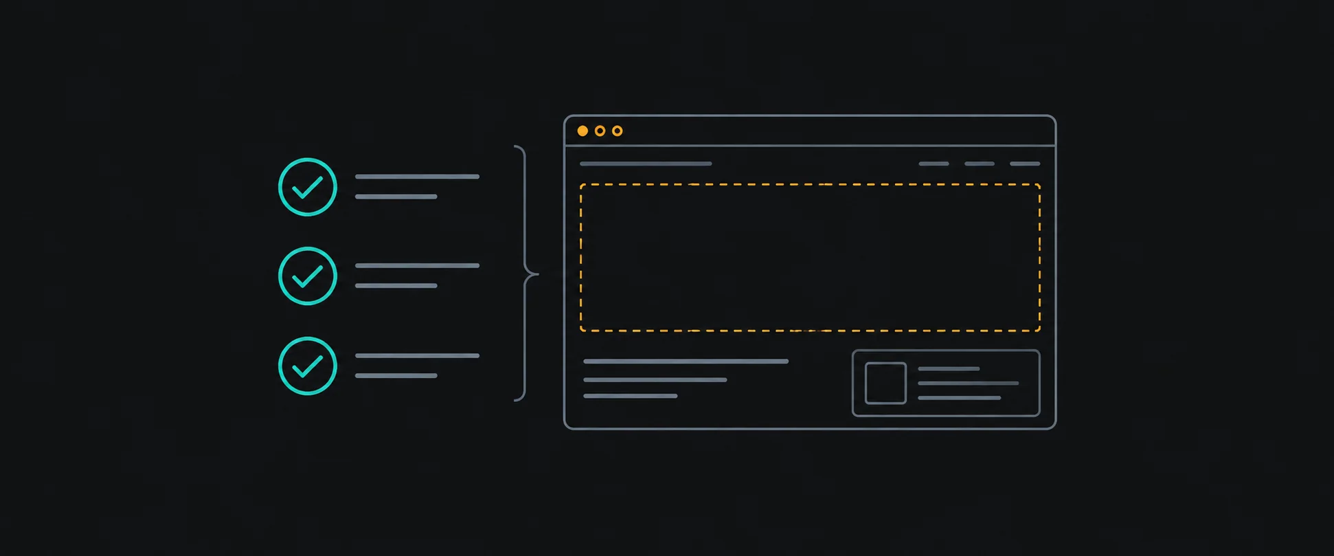
Recently I was reviewing a frontend prototype built with help from coding agents. The tasks had been worked through, and component tests were passing. On paper, there was a lot of evidence that the work was moving.
Then I looked at the actual site. The content felt extremely thin. Much of what was there was mock content, with no images, line art, or even simple icons to give the pages any visual character. CMS-backed journeys were empty. The result was mostly text, and it was hard to judge the experience I was supposed to be reviewing.
I also found that the Payload admin was failing even though the frontend scaffolding existed. A set of routes and components had taken shape, but I could not treat that as proof that the editorial path worked.
The work is still in progress. What stayed with me was the gap between the evidence we had collected and the question I actually needed answered: can someone use and evaluate this as a real website?
Green checks have a scope
A passing component test can tell me that a card renders the props it was given. A task marked complete can tell me that a piece of scaffolding was built. Those are useful facts. I still want both.
Neither result tells me whether the card receives meaningful content from the CMS, whether the surrounding page has enough context, or whether the next link leads somewhere useful. A test can be accurate and still leave the most important product question open.
That distinction matters even more when an agent can produce a lot of visible progress quickly. I need to be specific about which claim each check supports. If the claim is “this component handles an empty array,” a component test may be the right evidence. If the claim is “a visitor can explore the site,” I need to open the site and follow that journey with representative content in place.
Content is part of the interface
Mock content has a job. It lets me build against a shape before every editorial decision is settled. It also makes it easy to miss how little of the experience is actually present.
A page with a heading, a few generic sentences, and several empty sections might satisfy a layout contract. It doesn't show whether the site explains the subject, supports the visitor's next decision, or has enough substance to make the design feel coherent. A populated card list needs entries worth opening. A detail page needs enough context to answer the obvious next question. A call to action needs a meaningful destination.
For the next review, I want representative content seeded through the intended CMS path early enough to test the whole slice. It doesn't have to be final copy everywhere. It does need to resemble the content the page is meant to carry, and I should be able to tell what is provisional. Then I can verify that the content saved in the CMS is the content rendered on the page, including the relationships and links that carry a visitor forward.
The visual pass is product work
A prototype may not have finished artwork yet. The review still needs to make the intended experience legible. When a site is almost entirely text with no supporting visual language, I can't assess hierarchy, rhythm, or how the content is meant to feel in context.
Images and simple illustrations can carry meaning, create orientation, and give a page a usable visual rhythm. They should have a purpose and fit the content. Adding decoration just to fill space wouldn't resolve a weak journey either.
This is where I want a deliberate browser pass on both mobile and desktop. I want to see populated pages at each size, read the content in order, follow the primary action, and check whether the result makes sense. Screenshots can help capture the state, but I still need to interact with the pages and look at the actual content.
What I want in the acceptance pass
For a content-driven prototype, I would keep the acceptance check small enough to repeat:
- Seed a representative slice. Give the main route and at least one detail page content that resembles the intended experience. Label anything still provisional.
- Verify the CMS path. Sign in as an authorized editor, save a representative entry, and confirm that the corresponding page reads and displays it.
- Follow a complete journey. Start where a visitor would, open a populated item, and try the next meaningful action. Record empty or dead ends.
- Review the visual experience. Inspect mobile and desktop with content and intended visual elements in place. Check hierarchy, readable density, and whether images or icons help explain the page.
- Report the evidence separately. List the tests that passed, the journeys actually checked, and what remains incomplete or unverified.
These are the checks I want to bring into the next pass, not a claim that they have all been completed. The point is to make the remaining work visible while there is still room to change it.
The takeaway
I'm keeping the component tests. I'm also making the acceptance question more concrete: show me a populated page, show me where its content comes from, and let me follow the next step. When those checks sit alongside the test results, I have a much clearer picture of the product I am reviewing.