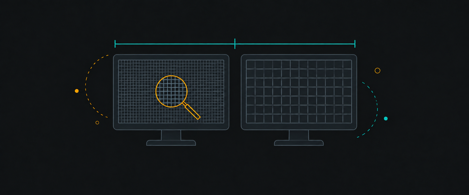
"The site looks tiny on my 4K monitor — add a 4K breakpoint."
Every frontend engineer eventually gets this request, and it's based on a reasonable-sounding confusion: the monitor is 4K, so surely CSS should know that. It doesn't — and it shouldn't. CSS responds to logical viewport conditions, not the resolution printed on the box.
CSS pixels versus physical pixels
A 4K monitor (3840 physical pixels wide) doesn't give the browser a 3840px-wide viewport. The operating system's display scaling (usually 150–200% on 4K) means the browser reports a logical viewport of roughly 1280–2560 CSS pixels — often indistinguishable from a plain 1440p display.
CSS media queries and layout operate in those logical pixels. Your stylesheet has no idea — and no way to know — that the physical panel is denser than a laptop's.
So why does the site look tiny?
If everything renders small on a big monitor, one of three things is usually true:
- Display scaling is set low (100% on a 4K panel) — an OS/monitor setting, not a website defect
- The layout is max-width-capped and the user wants a wider content measure — a legitimate design conversation about large-viewport typography, not a new breakpoint
- The user wants bigger text — which is a zoom or typography-scale question
Browser zoom and rem
Zoom is the user's preferred solution and it works well — if the CSS uses rem-based sizing.
clamp() with a vw term gives display-proportional scaling between sane bounds — which is usually what "add a 4K breakpoint" was actually asking for, expressed the way CSS intends.
The comparison table
| Concept | What it is | What it affects | Should CSS target it? |
|---|---|---|---|
| Physical resolution | Pixels on the panel (3840×2160) | Sharpness, image assets | For art direction only (srcset) |
| OS display scaling | How the OS maps physical → logical | Effective CSS viewport size | No — varies per user |
| CSS viewport | Logical pixels the layout sees | Media queries, vw, layout | Yes — this is what breakpoints use |
| Browser zoom | User's chosen text/UI scale | rem-based sizes, viewport | Yes — respect via rem, never fight it |
| Device pixel ratio | Physical ÷ logical density | Image sharpness | For srcset/image quality only |
When runtime scaling is justified
Legitimate cases exist: kiosk displays, wall dashboards rendered by a headless browser at a known viewport, or an app-level "UI density" setting. Those are explicit product decisions with controlled conditions — the opposite of sniffing hardware.
The senior-engineer answer to "add a 4K breakpoint" is a question: what does the user actually want — more content per screen, or larger text? Both are achievable with clamp(), a wider max-width measure, and rem-based type. None of them require knowing anything about the monitor.